

Cart
0
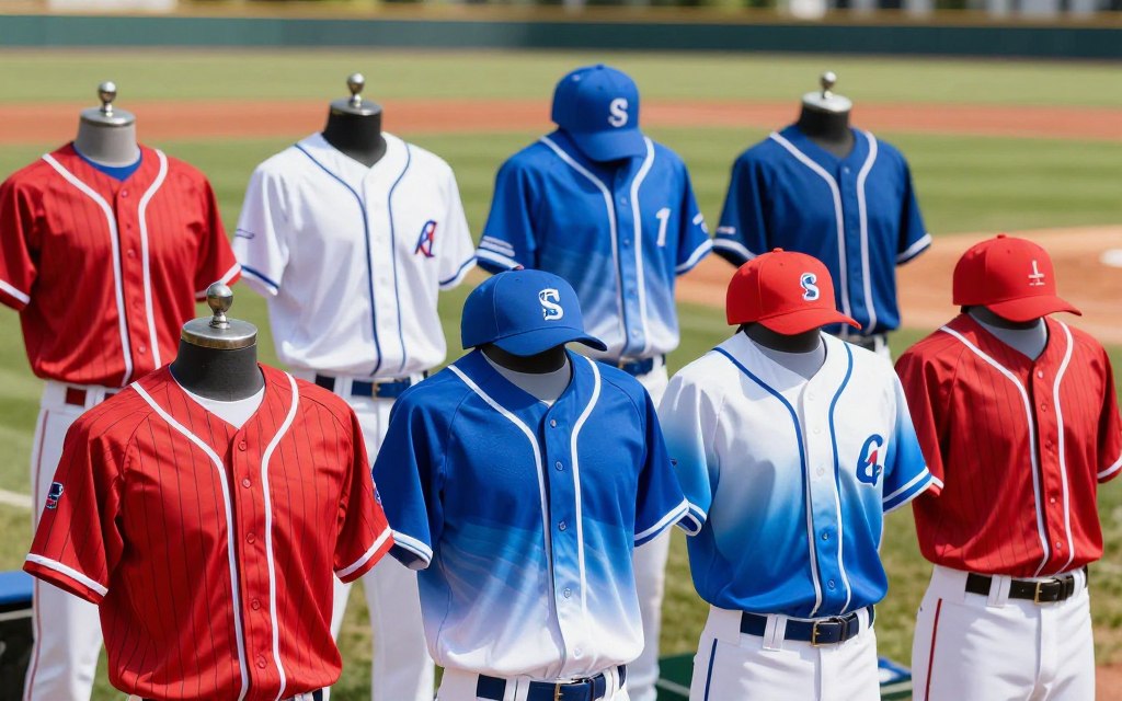
Have you ever wondered how a team's colors and patterns can transform their identity on the field? The choice of hues and designs plays a crucial role in creating a professional and recognizable image for any team. This article delves into the fascinating world of baseball uniforms, exploring how thoughtful design choices contribute to a team's confidence and presence during games.
In Major League Baseball, the tradition is clear: home teams often don white or light-colored attire, while away teams opt for darker shades. This distinction not only enhances visibility but also establishes a sense of pride and belonging among players. For instance, the Los Angeles Dodgers showcase a striking blue-and-white branding that fans instantly recognize.
Moreover, we will examine essential elements like player names, logos, and jersey construction. Each detail matters, as they must comply with league regulations, such as the requirement for back numbers to be at least six inches tall. By connecting visual appeal with league compliance, teams can ensure they stand out while adhering to the rules.

Key Takeaways
- Colors and patterns significantly impact a team's identity.
- Home teams typically wear light colors, while away teams wear darker shades.
- Consistent branding helps create a recognizable team image.
- Design elements must comply with league regulations.
- Attention to detail enhances overall team professionalism.
Introduction to Baseball Uniform Color Schemes
A team's choice of clothing is more than just a fashion statement; it defines their identity. Uniforms can greatly influence player confidence and fan recognition. When players wear stylish attire, they often feel like true athletes, fostering a deeper connection to the sport.
The Los Angeles Dodgers exemplify this idea. Their blue and white colors have become iconic, demonstrating how effective branding can last for decades. These colors not only represent the team but also evoke a sense of pride among fans.
Modern design trends are evolving as well. Teams now experiment with alternate jerseys, throwback styles, and performance-focused materials. This blend of tradition and innovation allows teams to stand out while honoring their history. As trends change, it’s crucial to differentiate between lasting traditions and fleeting fads.
Understanding League Guidelines and Color Requirements
The guidelines governing team attire play a vital role in shaping their visual identity. Traditionally, home teams wear white or light-colored clothing, while away teams opt for gray or darker shades. This distinction not only enhances visibility but also helps create a clear differentiation between the teams during a game.
It is essential for designers to verify that back numbers meet the league's minimum height requirement of six inches. This ensures that players can be easily identified, which is crucial in fast-paced situations. Additionally, matching undershirts, caps, pants, and trims help maintain a cohesive look across the entire outfit.
Here is a summary of the key requirements:
| Uniform Type | Color Standard | Additional Requirements |
|---|---|---|
| Home | White or Light-Colored | Matching undershirts required |
| Away | Gray or Darker Shades | Matching colors for all apparel |
| Back Numbers | N/A | Minimum height of 6 inches |
Lastly, teams should review their specific league rulebook before ordering custom apparel or alternate designs. Understanding these regulations can significantly enhance a team's overall image and professionalism.
Choosing Bold Team Colors for Impact
Colors wield a powerful influence in sports, shaping perceptions and evoking emotions. Each hue carries its own message, impacting how players and fans connect with a team. For instance, red is often linked to power and dominance, as seen with the Boston Red Sox. Their bold red not only energizes the team but also instills confidence in their supporters.
Blue, on the other hand, represents trust and reliability. The Kansas City Royals embody this with their calming blue tones, which resonate well with their fan base. Yellow is another vibrant choice, suggesting energy and optimism. The Pittsburgh Pirates utilize this bright color to create a lively atmosphere during games.
Black communicates strength and authority, as illustrated by the Chicago White Sox. While powerful, it can sometimes feel overpowering if not balanced with other shades. Lastly, green suggests growth and harmony, beautifully represented by the Oakland Athletics, who connect their identity with nature.

Incorporating Timeless Patterns into Your Uniform Design
Timeless patterns play a significant role in enhancing the visual appeal of a team's attire. Classic designs, such as pinstripes, have stood the test of time, with the New York Yankees being a prime example. Their iconic pinstripes create a quintessential look that not only signifies tradition but also helps to mask stains during games.
Color blocking is another effective method to emphasize certain areas of a jersey. By strategically using bold sections on sleeves and side panels, teams can create a dynamic visual impact. This technique can draw attention to specific parts of the uniform, making it stand out on the field.
Modern design trends also embrace gradients, allowing for smooth transitions between colors. Sublimation techniques enable designers to incorporate detailed geometric patterns without harsh visual breaks. This flexibility allows for creative expression while maintaining a clean overall look.
When designing, it's essential to match bold patterns with restrained palettes. This balance ensures that the uniform remains visually appealing without appearing cluttered. Lastly, viewing sample garments under stadium lighting is crucial, as digital previews may not accurately represent fabric colors or contrasts.
Utilizing "baseball uniform color schemes" for Consistent Branding
A well-defined system of colors can create a cohesive look for any team on the field. The Los Angeles Dodgers exemplify this with their consistent use of blue and white. These colors not only unify their jerseys but also extend to promotional materials, making the team easily recognizable.
When designing a team's attire, it is essential to ensure that all components share the same colors, trims, and design language. This includes jerseys, pants, caps, socks, and warm-ups. A defined color palette can enhance the overall visual identity of the team.
Here are some key considerations for teams:
- Define primary, secondary, and accent colors before selecting logos or decorative patterns.
- Utilize fully sublimated apparel to maintain consistent artwork across all pieces.
- A brand guide can assist coaches and manufacturers in reproducing the same visual identity each season.
Building Team Identity Through Customized Colors
A team's palette can reflect its historical roots and the spirit of its supporters. Choosing colors connected to local culture can significantly enhance a team's identity. For example, the Chicago Cubs use colors inspired by the city flag, fostering a direct connection with local fans.
Similarly, the Philadelphia Phillies utilize red, white, and blue to emphasize both Philadelphia heritage and American identity. These choices not only resonate with fans but also create a sense of pride and belonging.
Moreover, historical uniforms and community traditions can inspire modern designs. By incorporating elements from the past, teams can create continuity that deepens fan loyalty. It's crucial for players, coaches, families, and community stakeholders to provide feedback before finalizing the color palette.

Enhancing Uniform Appeal with Custom Design Options
Custom design options can significantly elevate the appeal of a team's attire. Teams today have various choices for customizing their outfits, particularly when it comes to printing methods. Two popular options are sublimation printing and traditional methods like screen printing and embroidery.
Sublimation printing offers unique advantages. This method embeds designs directly into the fabric fibers, ensuring that graphics resist fading, cracking, and peeling. Wooter Apparel, a leader in this field, has garnered over 2,000 five-star reviews and boasts a 4.9-star rating from 1,238 reviews.
On the other hand, ARES Sportswear has been assisting baseball teams and leagues for 30 years, providing quality custom apparel. When selecting a customization partner, teams should compare fabric options, artwork quality, production timelines, and customer support.
Coordinating Jersey, Pants, and Cap for a Unified Look
Creating a cohesive look for a team requires careful coordination of all apparel elements. Uniforms should align across jerseys, pants, caps, undershirts, socks, and accessories. This ensures that every player is easily identifiable during games.
The jersey acts as the visual anchor, while pants and caps repeat its primary and accent colors. Designers must consider the placement of team names or logos on the front of the jersey. Player names are typically positioned above back numbers, which must remain highly visible and at least six inches tall.
Here are some key considerations for effective coordination:
- Caps should feature restrained artwork, especially when the jersey includes pinstripes or large color-blocked panels.
- Pants and socks should reinforce the jersey palette, avoiding unrelated colors that could weaken the team’s overall appearance.
- Final samples should be reviewed as a complete uniform, as separate garments may look different when assembled on the field.
Youth Baseball Considerations: Style, Function, and Comfort
Selecting appropriate attire for youth sports is essential for both functionality and aesthetic appeal. Young athletes deserve clothing that enhances their performance while looking good. Color choices can significantly influence comfort and style on the field.
Powder blue has made a comeback, especially noted when the St. Louis Cardinals reintroduced it in the 2019 season. This vintage-inspired option is not only stylish but also has been favored by teams like the Toronto Blue Jays and Kansas City Royals.
Gray serves as a practical foundation for youth attire. It reflects heat better than black and hides stains more effectively than white. This makes it an ideal choice for young players who are active and often in the dirt.
However, caution is advised with all-black uniforms. Black absorbs sunlight, which can lead to overheating during hot games. While white uniforms may look classic, they can create additional laundry pressure due to inevitable dirt and stains.
Balancing Tradition with Modern Trends in Uniform Design
The interplay between tradition and innovation shapes the look of team attire today. Designers strive to create uniforms that reflect both the sport's history and contemporary aesthetics. This balance is crucial for fostering team identity and connecting with fans.
Utilizing script fonts can add a vintage baseball appearance while ensuring readability. Curving vintage lettering helps a jersey feel authentically connected to the sport's rich past. Additionally, left-chest logo placement remains a classic choice, leaving the right chest open for player numbers.
Maintaining a classic yet fresh aesthetic is essential. Small, proportionate graphics are preferred over oversized artwork that can overwhelm younger players. Pinstripes and throwback styles honor established traditions while modern materials enhance performance.
Ultimately, a well-designed uniform should incorporate one or two memorable heritage elements rather than attempting to combine every trend available. This approach ensures that the team's identity remains strong and recognizable.
| Design Element | Traditional Aspect | Modern Update |
|---|---|---|
| Font Style | Script Fonts | Readable Vintage Look |
| Logo Placement | Left-Chest | Open Right Chest for Numbers |
| Graphics | Small Proportions | Avoid Oversized Artwork |
| Patterns | Pinstripes | Performance Fabrics |
| Overall Design | Heritage Elements | Contemporary Updates |
Conclusion
In conclusion, a successful team attire begins with a thoughtful color palette that reflects its identity. It is vital to ensure contrast, comfort, visibility, and compliance with league standards. Checking home and away requirements, including lighter shades for home games and darker ones for away, is essential.
Incorporating elements like pinstripes, color blocking, and gradients can add personality without overwhelming the design. For youth teams, shades like gray and powder blue can help manage heat and stains while ensuring comfort throughout the season.
Moreover, durable customization options like sublimation provide vibrant designs, while coordinating all elements—jerseys, pants, caps, and accessories—creates a polished look. Ultimately, the strongest designs blend local history, player feedback, and tradition with modern materials, ensuring a recognizable appearance that endures beyond a single season.
FAQ
What are the most popular color combinations in baseball uniforms?
Some of the most popular combinations include navy blue and white, red and gray, and black and white. Teams like the New York Yankees and Boston Red Sox are known for their iconic color schemes.
How do team colors influence fan loyalty?
Team colors play a significant role in building fan loyalty. They create a sense of belonging and identity among supporters, making them more likely to wear team merchandise and attend games.
Are there specific guidelines for color choices in Major League Baseball?
Yes, Major League Baseball has guidelines that teams must follow regarding home and away colors. These standards ensure that players are easily identifiable on the field.
What is the significance of pinstripes in baseball uniform design?
Pinstripes are a classic design element that conveys tradition and authority. Teams like the Chicago White Sox have used this pattern to create a distinct and recognizable look.
How can teams incorporate local culture into their color choices?
Teams can draw inspiration from local history, landmarks, or cultural symbols when selecting colors. This connection enhances community support and pride.
What are the benefits of custom design options for uniforms?
Custom designs allow teams to stand out with unique styles, enhancing their brand identity. Options like sublimation printing provide vibrant colors and intricate designs that are long-lasting.
How important is comfort in youth baseball uniforms?
Comfort is crucial for young athletes, as it affects their performance and enjoyment of the game. Lightweight, breathable materials and proper fit can enhance their experience on the field.
What modern trends are influencing baseball uniform design?
Modern trends include the use of gradient colors and bold graphics. Teams are experimenting with innovative designs while still maintaining traditional elements to appeal to a wider audience.


