

Cart
0
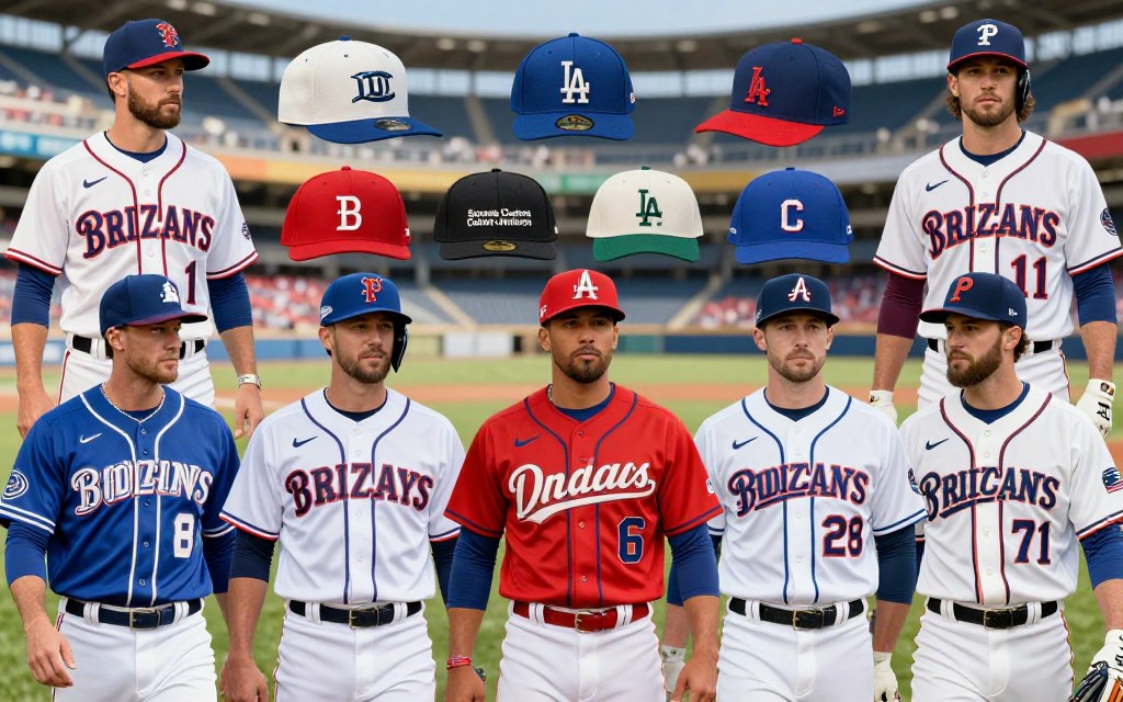
Have you ever wondered how the vibrant colors and unique designs of team jerseys reflect the rich history of baseball? The evolution of these uniforms goes beyond mere aesthetics; they tell stories of tradition, identity, and branding. With Nike's official contract since 2020, the landscape of team apparel has undergone significant changes.
This article serves as a practical guide to understanding the current state of team jerseys, their color schemes, and the latest design updates. It will delve into how Nike's partnership has influenced the uniforms worn by each Major League Baseball club. Additionally, readers will enjoy a structured overview of various teams, connecting modern designs with their historical roots.
Expect to see an analysis of notable teams like the New York Yankees, Chicago White Sox, Kansas City Royals, Texas Rangers, and San Diego Padres. The discussion will also touch on upcoming developments in 2024, 2025, and 2026, providing insight into materials, alternate designs, and merchandising changes.

Key Takeaways
- Nike has held the official contract for team jerseys since 2020.
- Current rules allow for home, away, alternate, and City Connect categories.
- The article provides a guide to modern designs and historical identity.
- Team-by-team analysis will highlight significant branding elements.
- Future developments will be discussed for the years 2024-2026.
Introduction to MLB Uniforms and Their Impact
From the colors to the designs, team apparel encapsulates the essence of baseball's storied history. These uniforms have transformed from simple wool garments to advanced polyester fabrics, marking a significant evolution in both style and functionality.
Since 2020, Nike has been the official supplier of team uniforms, bringing a fresh perspective to the game. This partnership has not only changed the look of uniforms but also their commercial value and branding strategies.
Uniforms serve as visual symbols, connecting a team with its city, players, and supporters during every game. They communicate a team's history and competitive identity while also fulfilling practical performance needs.
While matching uniforms are now a league requirement, early baseball did not enforce this rule consistently. This section will explore how uniforms blend emotional significance with the practicalities of the sport.
| Aspect | Historical Uniforms | Modern Uniforms |
|---|---|---|
| Material | Wool | Polyester |
| Design Consistency | Varied | Mandatory Matching |
| Supplier | Multiple | Nike |
| Emotional Connection | Emerging | Strong |
Evolution of Jerseys: From Wool to Polyester
The transformation of baseball jerseys over the decades showcases a remarkable shift in design and material. In the early days, heavy wool and flannel garments were the norm. However, by the early 1970s, a significant change began to take shape.
The Pittsburgh Pirates were the first team to adopt double-knit jerseys after the 1970 All-Star Game. This move set a trend that would soon be embraced by many teams. By the start of the 1972 season, sixteen teams introduced these innovative double-knit uniforms.
Even the iconic New York Yankees transitioned from flannel to polyester before the 1973 season began. This shift not only modernized the look of team apparel but also enhanced player comfort and performance.
Since 2000, MLB jersey collars have featured the league logo, marking a consistent element in official team apparel. This logo symbolizes the connection between the teams and the league, adding to the rich history of baseball uniforms.
Historical Uniforms: Sock Colors and Traditional Styles
The early days of baseball introduced unique elements like sock colors that played a vital role in team identity. The Cincinnati Red Stockings were pioneers in this regard, making sock color a defining feature of their club. This innovation helped fans easily recognize their team on the field.
In 1876, the Chicago White Stockings showcased their individuality by wearing caps in different colors. This practice was a precursor to the standardization we see in modern uniforms. By 1882, the National League assigned specific stocking colors to member clubs, further solidifying the visual identity of teams.
Traditionally, home uniforms were predominantly white, while road uniforms were mostly gray. This choice was practical, as gray helped conceal dirt accumulated during travel. These conventions created a visual language that still influences how fans interpret a team’s home and road identity.
Modern Era Uniform Trends and Innovations
The recent trends in team uniforms reflect a dynamic shift towards innovation and fan engagement. In 2023, Major League Baseball limited each club to home, away, two alternate uniforms, and one City Connect uniform. This change aims to streamline designs while still allowing teams to express their unique identities.
Comparing modern designs to the colorful uniforms of the Kansas City Athletics from 1963 highlights how far team apparel has come. For instance, the vibrant powder blue worn by teams like the Royals and Phillies has become a nostalgic favorite among fans.
Additionally, the Pittsburgh Pirates popularized pullover jerseys in 1970, which contrasted sharply with today’s performance-oriented jersey construction. As we look ahead to the 2024, 2025, and 2026 seasons, teams will continue to balance tradition with innovation to meet merchandise demands.
- Modern uniforms are limited to specific categories, enhancing brand identity.
- Powder blue remains a popular choice among several teams.
- Pullover jerseys paved the way for today's high-performance designs.
- Future seasons will explore the balance between heritage and modern aesthetics.
MLB Uniforms Today: A Comprehensive Team Breakdown
The story of baseball uniforms is one of change, capturing the essence of teams and their cities. Starting in the 1990s, Major League Baseball teams heavily marketed licensed caps and jerseys. This trend expanded the visibility of official team apparel beyond the stadium, creating a unique connection with fans.
Beginning in 2023, clubs have been allowed to use home, away, two alternate uniforms, and a City Connect uniform. This flexibility allows teams to express their identities through various designs. However, the 2024 template changes introduced by Nike and Fanatics sparked criticism from both players and fans, indicating a desire for more personalized options.
This section will evaluate how each team utilizes color, typography, logos, and historical references in the current season. It will separate timeless identities from those that seem dated or overly complicated. The breakdown will highlight established classics and teams whose uniforms continue to evolve through alternates and City Connect releases.

New York Yankees: Timeless Pinstripes and Branding
The New York Yankees exemplify how a consistent uniform design can create a powerful brand identity in sports. Their pinstripe home uniform features an interlocking “NY” logo, setting them apart from other teams that display their nicknames prominently.
Since the 1930s, the Yankees’ uniforms have changed little, providing a strong connection to their storied past. This commitment to tradition is evident in their status as the only team in Major League Baseball without an official alternate uniform.
In 1973, the Yankees transitioned from flannel to double-knit fabric, demonstrating that even a traditional organization can adapt when necessary. This restraint in design reflects their strategy of maintaining a timeless aesthetic rather than frequent redesigns.
Key points about the Yankees’ uniform include:
- The pinstripes and interlocking NY create one of baseball’s most recognizable visual identities.
- Minimal changes since the 1930s ensure a consistent connection to the past.
- The absence of an official alternate uniform reinforces their strict branding approach.
- The 1973 fabric change highlights adaptability within tradition.
- Restraint in design remains central to their apparel strategy.
Chicago White Sox and Team Identity: A Closer Look
The Chicago White Sox's uniforms tell a story of tradition and evolution, showcasing their unique identity. This team presents a clean, restrained look that emphasizes historical relevance, giving their design more value than its understated appearance suggests.
From 1976 to 1981, the White Sox experimented with all-blue uniforms, featuring large collars and untucked jerseys. In a unique twist, they even wore shorts in two games. This period highlighted their willingness to innovate while staying true to their roots.
Between 1982 and 1986, the club opted for pullover uniforms that displayed “SOX” prominently, rather than the city name. This choice marked a significant shift in branding for the team.
With Noah Schultz making his MLB debut for the Chicago White Sox at Rate Field on April 14, 2026, the current visual identity remains relevant. Future updates may focus on strengthening the logo while preserving the historical elements that keep the White Sox recognizable.
| Aspect | Historical Significance | Modern Design |
|---|---|---|
| Color Scheme | Classic White and Black | Innovative All-Blue |
| Logo Design | Traditional “SOX” | Modernized Branding |
| Uniform Type | Pullover Style | Contemporary Fit |
| Debut Event | Historic Moments | Noah Schultz's 2026 Debut |
Kansas City Royals: Alternate Jerseys and Crown Details
The Kansas City Royals have embraced their heritage through distinct jersey designs that tell a story of pride and tradition. The powder blue color has become synonymous with the team since the 1970s, making it a beloved choice among fans.
The Royals were among the last teams to wear flannel, transitioning to double-knit fabrics for the 1973 season. This shift linked their current apparel to a broader movement in baseball uniform design.
Vinnie Pasquantino and Jac Caglianone represented Kansas City at Wrigley Field on July 23, 2025, showcasing how the team's recognizable colors remain prominent in contemporary baseball.
The Royals’ alternate jerseys are noteworthy because they add variety without necessitating a complete redesign of the franchise’s established identity. The crown motif reflects the team's name, yet stronger gold details could enhance this symbolism.
San Diego Padres: Balancing Tradition and Modernity
The San Diego Padres' uniforms represent a unique blend of tradition and modernity in the world of baseball. Since 1969, the Padres have embraced a brown-and-yellow color scheme that sets them apart from other teams. This distinctive palette has become a key element of their identity.
Brown is a primary color for the team, showcasing their commitment to maintaining a strong visual identity. Nike has supplied the Padres' uniforms since 2020, ensuring that their traditional colors are integrated into a modern manufacturing system.
San Diego's strategy illustrates how returning to historically significant colors can enhance fan recognition. The analysis will explore whether the contemporary alternate designs truly enrich the Padres' heritage or risk fragmenting their overall identity.
Texas Rangers: Texas Pride in Uniform Design
The Texas Rangers' uniforms are a testament to the pride and heritage of the Lone Star State. The team's design choices reflect a strong connection to Texas culture, making their uniforms one of the most geographically explicit in Major League Baseball.
From 2009 through 2019, every jersey featured the state name, emphasizing their local roots. In 2020, the Rangers introduced a new uniform set after moving to Globe Life Field, marking a significant update in their design approach.
Currently, the Rangers sport red and powder-blue alternate jerseys that have garnered positive attention. These options offer a more vibrant visual identity compared to the script “Rangers” treatment on their home uniform, which has faced some criticism.
On August 24, 2025, Danny Coulombe represented Texas at Globe Life Field, showcasing the team's design in action. The City Connect uniform will be evaluated separately, as its reception has not matched the enthusiasm for the traditional Texas-inspired elements.

Other Notable Teams and Their Unique Uniform Stories
The diverse array of team jerseys reflects the unique stories and traditions of baseball franchises. For instance, the Tampa Bay Rays moved away from the Devil Rays aesthetic, adopting a modern navy and powder blue palette. This change showcases their evolution in branding.
The Minnesota Twins combine red, navy, and powder blue, although their “TC” logo has faced some criticism for lack of distinctiveness. Meanwhile, the Seattle Mariners sport a navy, teal, and silver color scheme, balancing classic styles with contemporary details.
Additionally, the Colorado Rockies emphasize purple, creating one of the most unconventional color identities in sports. The Athletics introduced a gold “Sacramento” alternate in 2026, adding a fresh twist to their traditional look.
Notable player representations include Cal Raleigh and Julio Rodríguez for Seattle in the 2025 American League Championship Series, and Junior Caminero for Tampa Bay during spring training on March 24, 2026. The section will also compare recognizable approaches from the Los Angeles clubs, Blue Jays, Braves, Astros, Giants, Guardians, Diamondbacks, Pirates, Marlins, Brewers, Red Sox, and Athletics.
The Impact of Modern Fabric Technology on Performance
The evolution of fabric technology has profoundly influenced the performance of baseball uniforms over the years. Since the early 1970s, double-knit polyester has been the standard material, offering durability and comfort. This transition has allowed players to perform better throughout the long baseball season.
In 2024, Nike and Fanatics introduced the Vapor Premier chassis, designed to make uniforms lighter and more breathable. This innovation aimed to enhance performance during high-intensity sports competition. However, some players and fans criticized the new template for quality issues, reduced lettering, and limited customization options.
Since 1993, New Era has supplied MLB caps, ensuring consistency across teams and game environments. In 2007, polyester caps became standard, featuring black underbrims to reduce glare during play. These advancements reflect a commitment to improving player experience on the field.
| Feature | Historical Material | Modern Material |
|---|---|---|
| Primary Fabric | Wool | Double-Knit Polyester |
| Cap Supplier | Multiple | New Era |
| Cap Material Standardization | Not Standardized | Polyester |
| Black Underbrim Introduction | N/A | 2007 |
Economic and Merchandising Influence on MLB Uniforms
The commercialization of baseball uniforms has transformed the way teams engage with fans and generate revenue. Since the 1990s, MLB teams have heavily marketed licensed caps and jerseys, making them a significant revenue source. This trend highlights how essential merchandising has become in the sports industry.
Nike, which has held the official contract for team uniforms since 2020, plays a crucial role in this evolution. Their partnership with Fanatics has further influenced the manufacturing and merchandising landscape. In 2024, they introduced the Vapor Premier chassis, aiming to enhance performance through lighter materials.
However, this rollout faced criticism for quality concerns and limited customization options. In response, Nike reversed some changes in 2025, showing that player and consumer feedback can shape uniform design. The recent Collective Bargaining Agreement allows for corporate patches and helmet advertising, expanding commercial visibility for teams.
| Aspect | Impact on Revenue | Recent Changes |
|---|---|---|
| Licensed Merchandise | Major Revenue Source | Increased Focus |
| Nike's Role | Official Supplier | Vapor Premier Introduction |
| Consumer Feedback | Influences Design | Reversal of Changes |
| Advertising Regulations | Expands Visibility | Corporate Patches Allowed |
Uniform Numbering, Regulations and Player Identity
The introduction of jersey numbers marked a pivotal moment in baseball history, enhancing player recognition and team identity. The Cleveland Indians first used jersey numbers in Major League Baseball on June 26, 1916. This innovation drew inspiration from football and hockey, allowing fans to identify players more easily.
In 1929, the Indians and New York Yankees introduced back numbers, which became standard practice across the league. By the mid-1930s, nearly every team had adopted this feature, with the Philadelphia Athletics being the last to do so in 1939.
Official regulations now require players to wear matching uniforms, back numbers, and consistent exposed undershirts. This uniformity not only fosters team spirit but also enhances the spectator experience.
One of the most significant moments in uniform history occurred in 1997 when Major League Baseball retired Jackie Robinson’s number 42 league-wide. This act permanently linked uniform identity with baseball history.
- Jersey numbers first appeared with the Cleveland Indians on June 26, 1916, after football and hockey helped inspire the practice.
- The Indians and Yankees introduced numbers on the back in 1929, making player identification easier for spectators and scorekeepers.
- By the mid-1930s, nearly every MLB team had adopted back numbers, with the Philadelphia Athletics becoming the final exception until 1939.
- Official rules require identical team uniforms, back numbers, matching exposed undershirts, and approximately equal sleeve lengths.
- Jackie Robinson’s number 42 became the only league-wide retired number in 1997, permanently linking uniform identity with baseball history.
Throwback and Special Event Uniforms
Every stitch in a baseball uniform tells a story, connecting players and fans to the game's past. Major League Baseball teams often celebrate this history through events like “Turn Back the Clock Day.” During these games, teams don historical uniforms that evoke nostalgia and honor earlier generations of players.
In 1999, MLB introduced “Turn Ahead the Clock Day,” where teams showcased futuristic designs. This contrast highlighted the rich history of uniforms while playfully imagining the future of baseball attire.
The Los Angeles Dodgers, for instance, occasionally wear Brooklyn Dodgers designs during special anniversaries. This practice preserves the cultural memory of a relocated franchise and connects current fans with the team’s storied past.
On April 15, every player, manager, and umpire wears number 42 to honor Jackie Robinson’s debut anniversary. This tribute reinforces the significance of history in the sport.
Throwback uniforms generate strong fan reactions. They combine nostalgia, historical education, and merchandise demand, creating visible links to championship eras.
Conclusion
Each team's jersey serves as a canvas, showcasing a blend of history and innovation. The connection between traditional designs and modern fabric technology creates a unique narrative in the world of sports. For instance, the Yankees illustrate how an unchanged identity can maintain power, while teams like the Rays and Rockies demonstrate the appeal of distinctive updates.
The White Sox, Royals, Padres, and Rangers highlight different methods of balancing historical significance with contemporary designs. Furthermore, the roles of Nike and Fanatics in merchandise have made uniform construction a vital part of the sports economy.
Finally, elements like number 42, throwback games, and special-event jerseys remind us that uniforms can preserve cultural memory beyond a single game or season. The most successful designs today link recognizable colors and symbols with practical materials that enhance player performance on the field.
FAQ
What are the key features of the New York Yankees' uniform?
The New York Yankees' uniform is known for its iconic pinstripes, navy blue color, and the interlocking "NY" logo. This design has remained largely unchanged over the years, symbolizing tradition and excellence in baseball.
How do the Chicago White Sox's uniforms reflect their team identity?
The Chicago White Sox's uniforms often feature a sleek black and white color scheme, which emphasizes their bold team identity. Recent designs have incorporated modern elements while paying homage to their historical roots.
What distinguishes the Kansas City Royals' alternate jerseys?
The Kansas City Royals' alternate jerseys often showcase their signature royal blue color and crown details. These designs aim to celebrate the team's heritage while providing fans with stylish options for game day.
How have the San Diego Padres balanced tradition and modernity in their uniforms?
The San Diego Padres have embraced both traditional and modern elements in their uniforms, using vibrant colors and innovative designs. This approach allows them to appeal to a diverse fan base while honoring their history.
What is the significance of the Texas Rangers' City Connect uniform?
The Texas Rangers' City Connect uniform is designed to reflect the culture and spirit of Texas. It features unique color schemes and designs that resonate with local fans, enhancing their connection to the team.
How has modern fabric technology influenced baseball uniforms?
Modern fabric technology has improved the performance of baseball uniforms by making them lighter, more breathable, and moisture-wicking. This enhances player comfort and performance on the field.
What role do licensed goods play in the merchandising of team uniforms?
Licensed goods significantly contribute to the merchandising of team uniforms by allowing fans to purchase authentic apparel. This not only boosts revenue for teams but also strengthens fan loyalty and engagement.
What are some notable throwback uniforms in MLB history?
Notable throwback uniforms often celebrate significant moments in a team's history, such as the "Turn Back the Clock" Day. These uniforms evoke nostalgia and allow fans to connect with the past.


